The Challenge
Improve the usability and the intuitiveness of the eLearning site to increase the conversion rate in different sections of the site
The App's user interface (UI) had unintuitive commands and it lacked a proper Visual System
Online MarKeting Institute ( OMI )
OMI is an e-learning website that offers a variety of classes and certifications on relevant digital marketing topics.
www.onlinemarketinginstitute.org
My Role
UI, UX Designer
Worked with the Online Marketing Institute to improve their user experience to increase their conversion rate. Conducting UX methodologies, and aligning their business and users' goals efforts into one final product. Leading the handoff efforts and involving development and stakeholders in the design process
Design Process
Through Usability Diagnostics, I could identify the initial main barriers OMI’s site was having.
Giving me a starting point to define a strategy.
I designed a specific plan to tackle the issues and needs the site required at the moment. Validating design concepts with potential users, allowed me to understand their pain points and mental models to come up with design solutions that tackled not only their needs but the business as well.
My process consisted of the following:
● Analysis
● User Validation
● UI Design
● Development Handoff

User Validation
In order to get user insights, different methodologies were used to achieve that goal.
I conducted Usability testing, interviews, and Five Second Test Sessions in different sections of the site.
Usability Testings
I tested the Certification & Series Section with potential users to gather valuable feedback and find out pain points in their experience. Only 58% of the tasks were done successfully from the tests (five tasks were given to users).
User Insights
1.- Searching and finding content in the site was difficult for users
● Users had to spend time searching and guessing for information they would like to access
● Users generally go back to the home page when searching
2.- It was hard and unintuitive for users to find triggers and start desired actions
● Users felt that nothing happened on the page when they navigated through the pages since the information was identical
● The page didn't provide assistance or feedback on what was happening for the users
● It's hard for users to know what items are clickable on the site ( lack of affordance )
● It was hard for users to start any certification right away
3.- Terminology and user mental models on the certification/series section was confusing
● Video lessons and the curriculum format on the certification and series section was confusing
● Classes didn't work as users expected them to work

User tasks results & point allocation from usability testings ( Usability Testing Template )
User Interviews & Five Second Test
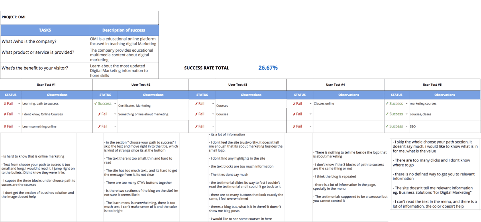
I conducted one on one user interviews and a five-second test with potential users. Getting valuable insights on the current state of the site and a score of 26% success rate of users not being able to answer the following questions after exploring the page
What is the company about?
What product or service is provided?
What are the benefits to the visitors?

Results and feedback from user interviews and five secon test
User Insights
1.- Users Noticed Repeated information
2.- Free trial and prices were confusing to the users
3.- The site didn't offer relevant information of what OMI was about or any of its benefits
4.- User was overwhelmed by the amount of irrelevant information the site had
5.- The users were overwhelmed with the number of calls to actions on the site
6.- Mega menu had overwhelming information and poor contrast hard to navigate
UI Design Solutions
I created a user interface that met users' mental models, with the right affordance of elements, in which users could find the information they needed without the site being over intrusive. After the second round of testing, I found out users could navigate and use the site better, increasing the success rate of the tasks to 80% and 20% indirect success completing the tasks with another path than the expected
Home Page
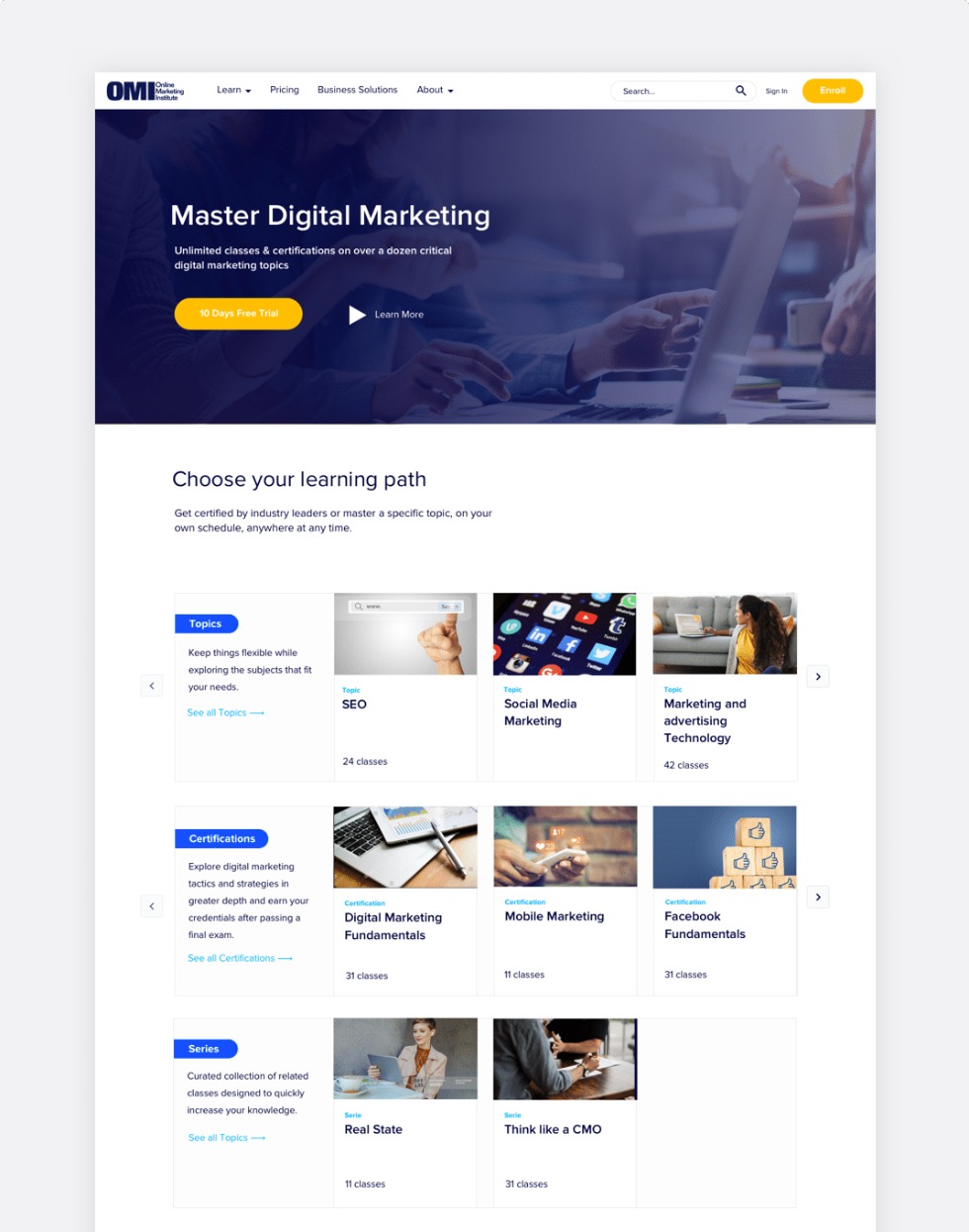
I created a solid funnel with a clear message of what OMI does and what kind of services it offers. Also, restructuring the homepage learning path to showcase OMI’s services.
Certification Section
I made sure the user got feedback whenever an action was made, providing little hints to where they should go or what they should do next. I created a visual consistency on all clickable elements. To make the site more intuitive for the user.

Iterate Design Solutions
After having a new round of testings I found out that users could navigate and use the site better increasing the success rate of their tasks to 80% and 20% indirect success completing the tasks with another path than the expected
Let's Talk!
Feel Free to send me a line at mmedina.ldg@gmail.com
Miguel Medina Design All Rights Reserved 2021
