Building Focus UI — Curebase Design System
Design Systems · Product Design

CONTEXT
Curebase is a clinical research platform used by research teams to run decentralized clinical trials. As the platform scaled, the absence of a unified design system led to UI inconsistencies, slower development cycles, and growing UX debt.
I led the creation of Focus UI, a scalable design system designed to unify the product’s visual language, streamline collaboration between design and engineering, and accelerate product development.
THE TEAM
Senior Product Designer (Me)
1 Product Designer
1 Lead Engineer
TIMELINE
June 2023- Oct 2023
Focus UI became the central source of truth for UI components and tokens across the Curebase platform.
Impact
• Reduced UI/UX inconsistencies across core product features
• Faster design-to-engineering handoff through reusable components
• Increased component adoption in new product development
• Reduced manual specification work during implementation
• Established a scalable design foundation for future product growth
The Problem
Before Focus UI, the design and engineering workflow suffered from several systemic issues.
PROBLEM MAPPING
No Component Library
Screenshot-Based Design Workflow
There were no reusable components in Figma, forcing designers to rebuild UI elements for every feature.
Designers relied on platform screenshots to replicate UI patterns, leading to inconsistencies and outdated references.
Growing UX Debt
Inconsistent visual patterns accumulated across the platform, creating usability issues and making the product harder to maintain.
Design Strategy
Instead of building a full design system upfront, I focused on creating a strong foundation first, then prioritized components aligned with product roadmap needs.
The system was structured around four pillars:
Design Tokens
Standardizing the visual language of the product.
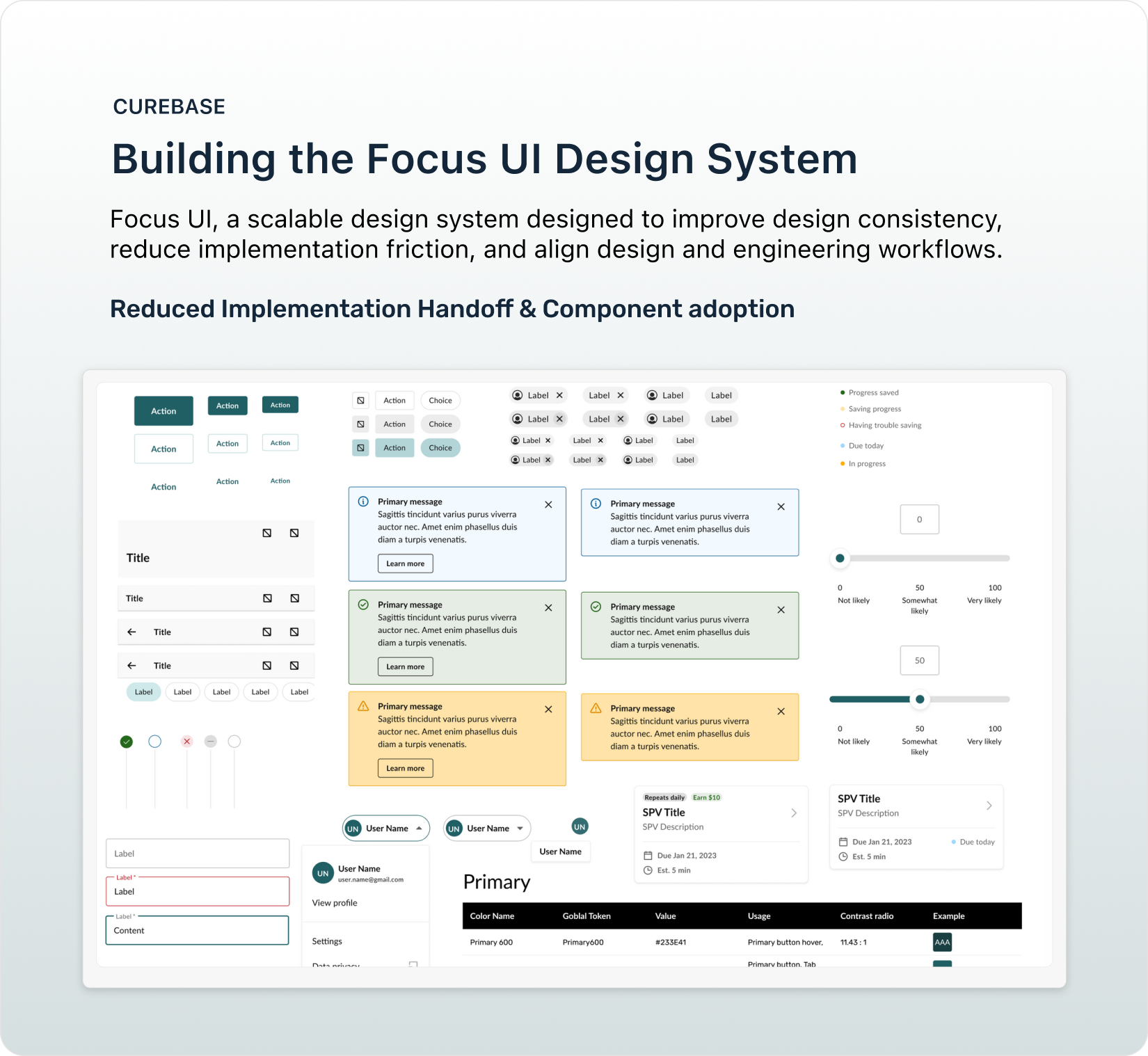
Component Library
Reusable UI components built in Figma.
Documentation
Clear guidelines for component usage and behavior.
Design-Engineering Collaboration
Processes to ensure consistent implementation.
Phase 1 — Establishing the Design Foundation
The first step was understanding the current state of the product’s UI. I led design audits with the design team to catalog existing visual patterns across the platform.
Key Findings:
Inconsistent color usage
Accessibility contrast issues
Multiple spacing scales
No semantic color system
Fragmented border radius and shadow values
")
Focus UI Design Tokens
I introduced a design token system to standardize the platform’s visual language.
Token categories included:
Color palette
Spacing system
Typography scale
Border radius
Shadows
Grid system
To ensure long-term adoption, I partnered with engineering to define a shared token naming convention compatible with development frameworks.
Phase 2 — Component Library
Once the token foundation was established, I began building the Focus UI component library in Figma.
Instead of designing every component at once, we prioritized components needed for upcoming product milestones: Patient Experience MVP, CRC Scheduling System
This ensured the design system immediately supported real product development.

Figma Component Library
Phase 3 — Establishing Design System Processes
To address this, I introduced a set of collaborative processes between design and engineering.
Design System Ceremonies
Weekly component design reviews
Engineering implementation reviews
Bi-weekly product alignment meetings
Cross-team design system syncs
These ceremonies created a structured workflow for proposing, reviewing, and implementing components.

Design System Component Creation & Review Process
Phase 4 — Designing for Platform Scale
As the platform expanded, the design system needed to support multiple teams and environments. I collaborated with the mobile, platform, and API teams to define core Components, Shared components used across the entire platform, experience-Specific components, and components tailored for specialized workflows.
This architecture ensured Focus UI could scale across the platform while maintaining consistency.

Design System Component Creation & Review Process
Documentation
To support adoption, I created comprehensive component documentation covering:
Component purpose
Usage guidelines
Supported variants
Interaction behavior
Accessibility considerations

Component Documentation
Documentation was initially stored in Figma, where designers were already working with components.
As the system evolved, documentation began expanding into the Focus UI Storybook repository, allowing engineers to reference implementation details.
Takeaways
What Worked
What Could Be Improved
Design tokens and naming conventions were critical for enabling long-term system growth.
Building components tied to upcoming product features accelerated adoption.
Collaboration rituals between design and engineering were essential for sustaining the system. Prioritizing the ceremonies could benefit the different teams greatly.
Let's build better products together!
Feel Free to send me a line at mmedina.ldg@gmail.com
Miguel Medina Design All Rights Reserved 2026